
 View history
 Edit
Edit
Translation Tips
Table of Contents
- Translation of Onomatopoeias
- Editing Onomatopoeias in Inkscape
- Resize letters one by one
- Rotate letters
- Horizontal (in-between character) spacing
- Vertical (baseline) spacing
- Tweak the aspect (SVG Filters)
- Advanced: XML editing
- Speech-bubbles geometry
- Bold and Italic
- Custom episode header
- Custom fonts
- Alignement
- Language Specific Notes
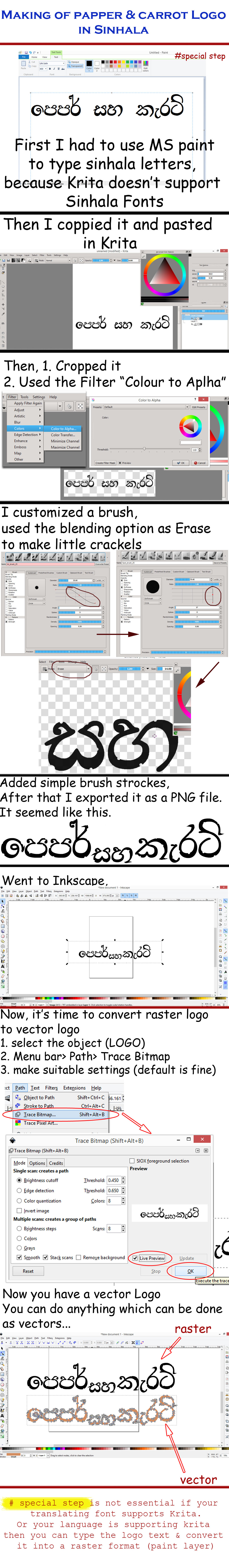
This page contains Inkscape tips, translation tips, and more tips to help you while translating Pepper&Carrot SVG files.
Translation of Onomatopoeias
Translating sound effects can be difficult. In case you find yourself having difficulty translating a sound: just trust your instincts provided by comics in your culture and use the spelling that sounds most right to you. Sometime it could be as simple as trying out the sound out loud with your mouth, and then using the phonology of your language. The result is anyway often very subjective and will be only here to show to the reader that a sound is important for the story and/or help their imagination to complete the missing soundtrack. Be creative!

Editing Onomatopoeias in Inkscape
I had to find a compromise between having artistic onomatopoeia and something possible to edit. You can always start by editing text as you would do by double clicking on it and type your translation. Many effect will works fine this way.
Unfortunately, some part of the text effects will be deleted by the editing and not look as it was on the source:

So here is a list of method you can apply to recover the effects:
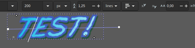
Resize letters one by one
A big classic (and the case in the visual above "common issue") is when the onomatopoeia has different size for each letters. It convey the volume of the sound: fading, or increasing. This type of data are generally lost while editing; but can be edited back by selecting each letter and giving them a different size (eg. 200px, 180px, 160px, etc...).
Rotate letters
Rotation of individual letters can be very useful to produce cascading effects. I often apply the same value to all the letters of a soundFX and shear the whole box or put the text on a path. Unfortunately, here also the rotation gets crunched at editing the text. Values can be positive (clockwise) or negative (anti-clockwise).
Horizontal (in-between character) spacing
To space the letter or to overlap them. I often use it to overlap them a bit to give a bit more packed aspect to the full sound; making the letter touch each other.
Vertical (baseline) spacing
More rarely used; each letters can have various high compare to the baseline of the text. It's nice to create some waves of high in the text and simulate some modulation of pitch of sound. Some values can be negatives (under the baseline) and some positive (over the baseline).
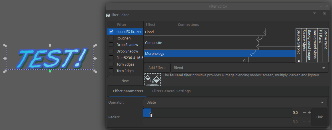
Tweak the aspect (SVG Filters)
Almost all the sounds effect you'll meet in Pepper&Carrot uses SVG filters. These filters are stack of effects that allows to add multiple outlines, variations of stroke, shadows and more. If you want to tweak the effect and access to this stack of settings, select the text and open the dialog Filters > Filter Editor. Then you'll have sliders to edit all the thickness and colors of the effect. It's rarely required to translate the webcomic; but I can imagine the situation where the effect is too strong and affect the glyph of a language. In this case, calming the turbulance, the width, or the drop shadow of an effect might be useful.
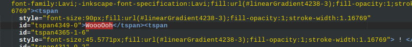
Advanced: XML editing
To finish, the ultimate method when you want a 1:1 copy of the effect, is to edit the data of the SVG file directly. This method is advanced because it requires to edit the SVG file with a text editor and locate in the jungle of XML tags where the letter of the effect are printed in it. You might need to search (Ctrl+F) for it. But once you found them (often encapsuled in their own XML tags), you can easily replace only the text with your translation, save the text and reopen with Inkscape to see the rendering: the effect should be totally preserved.
Speech-bubbles geometry
All speechbubbles are white geometric shapes made of vector point composed of two parts:
- The body (the bubble)
- The tail
Because both element are white or use the same color and borderless they merge visually into a single shape.
Padding
Keep a good looking padding distance around the text; a text touching the edge of the speechbubble doesn't look good in general.
Adapting the Shape
The arrow tool on the top of the vertical toolbar of Inkscape will allow you to deform the edges of the speechbubble. You can adapt the geometry of the speechbubble to match your translation (sometime translation needs larger speechbubble, or smaller). The tool "Tweak Object by Painting or Sculpting" of Inkscape is also useful to deform the speechbubble to wrap better around your texts.
Mirroring
Sometimes, a speechbubble would fit its text or surroundings more easily if it was mirrored vertically or horizontally, like the bottom speechbubble in this example:

This can be a lot faster than manually deforming the speechbubble. Here are the Inkscape buttons to do this:

Bold and Italic
Select only the text you want to make bold, then change the font style to the bold one. Do the same for Italic.
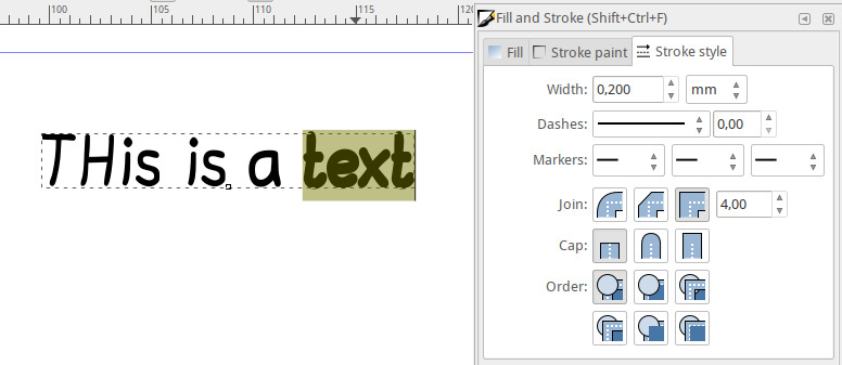
If the font you are using doesn't have a bold variant (for example 'Drukah'), you can select the text and add a StrokePaint to it, and then change the StrokeStyle width. It will create a faux-bold; a method I used a lot on the first episode, before I made the Bold variant for Lavi.
Custom episode header
Tharinda Divakara created a tutorial about how to create a cool vector title with Pepper&Carrot style. You can read it here.
Custom fonts
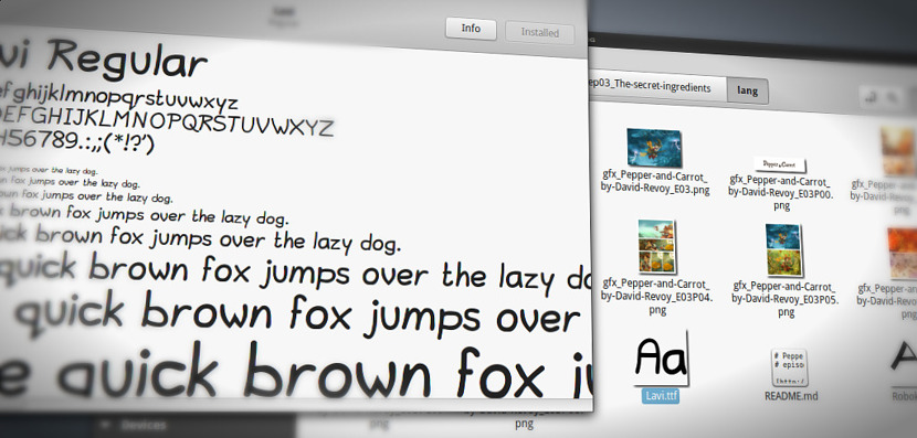
You can add to the Pepper&Carrot 'fonts' Framagit repository new fonts for your language.
License requirements
The fonts need to be published under a free license or released in the public domain.
The following font licenses are accepted:
- Public domain fonts
- GNU/GPL fonts
- CC-0 fonts
- CC-BY fonts
- SIL Open Font License (OFL)
Font information
To ease the storage of the font on the project and its maintenance, it is convenient to also keep the following information in the repository:
- Author name or nickname of the font (File Fontname.COPYRIGHT)
- Link to the source website distributing the font. (File Fontname.COPYRIGHT)
- License file itself, txt version. (File Fontname.LICENSE)
For the formatting, look how it is done for other fonts in the repository here.
Where to find new ones?
Sources for finding new open fonts:
- Font Library
- The League of Moveabletype
- Fontspace with category “Open”
- Font Squirrel
Alignement
Center alignment of titles

On some episode titles and thumbnails, the original text has not been defined as center aligned. So, since your translation will have a different width, the text layout will not be clean any more:

If you have this case, simply go to "Object" -> "Align and Distribute...", and in the docker "Align and Distribute..." that should appear (or blink if it was already on your monitor) select the option "Relative to: Page" and click the icon to align the center axis. Done!

Consistent line distance
Sometimes, text will flow across multiple interconnected speechbubbles and we will want to keep the layout consistent. Here's an example:

If your translation has more or less lines than the original, the layout will not work any more:

We will want even gaps between the lines (of course, you would also have made the middle bubble less high and moved the text closer together, but we skip this for now).
Use the Shift key and your mouse to select the all text objects that you want to distribute evenly. Then select "Object" -> "Align and Distribute..."

Click on the "Make vertical gaps between objects equal" icon:

The vertical positioning has now been fixed while keeping the horizontal positions as they are.
 Done!
Done!
Language Specific Notes
Lojban [jb]: notes about the style
- always rely on the CLL
- use Simple Lojban since the target audience are children:
- use as few gismu and cmavo as possible
- if a gismu or a cmavo is common then feel free to use it, though
- use any attitudinals/ki'ai + "cmevla/brivla", even experimental ones since the comic is full of interjections/psychomime/etc.
- for translating specific concepts, e.g. names, narrow scientific/math concepts consider using cmevla or (when it's really necessary) experimental brivla (even experimental gismu), e.g. texno, faumji. Such cases must be rare and not break the flow/comprehensibility of episodes
- faumji despite having precise sense can be understood by children as explicitly unfathomable lingo
- texno (if not .texnos.) might be used only for the name of a clan
- spell language/monster language is supposed to be half-comprehensible so consider using distorted Lojban